
RENCI teams up with Duke University researcher to use visualization to understand disease risk factors and symptoms. The age of big data presents both great opportunities for new knowledge as well as challenges in figuring out how to interpret, organize and use such large quantities of data. Data analysis and management are especially important hurdles to overcome in medicine, where data can help physicians better understand and treat disease.
RENCI Senior Visualization Researcher David Borland, PhD, works with Ed Hammond, PhD, director of the Duke University Center for Health Informatics, to develop ways to improve physicians’ access to, and comprehension of, large sets of medical information by transforming the data into easy-to-understand visual formats.

This image shows results of a query of the Duke Medical Center Electronic Health Record (HER) system. The squares represent the top two users of the system and circles represent the queries they initiated—the bigger the circle the more the term was queried. Light red lines connecting query terms show the strength of the relationship between those terms. The green section shows terms used by both users. This visualization was used on existing data to better understand the kinds of queries made by users and see how queries relate to each other so that future visualizations could aggregate data in meaningful ways.
“Most of the results of physicians’ queries of medical records come back in Excel spreadsheet format, which is time consuming and tedious to sift through,” said Borland. “The vast quantities are also becoming more than the human mind can comprehend. When talking [to Hammond] we thought about the old adage ‘A picture is worth a thousand words,’ and decided to begin making some sort of graphical representation.”
Borland and Hammond hope the visualizations will reveal patterns in the data that will help clinicians understand disease risk factors and symptoms and point them toward effective treatment plans. The visualizations are interactive, giving users the ability to explore and gain a deeper understanding of what the data represent.
Hammond, also a professor in Duke’s School of Medicine and an adjunct professor in the Fuqua School of Business, connected with Borland over a year ago while looking for a visualization expert to teach a course for a proposed Health Informatics program at Duke. After discussing their respective specialties, they decided to work together on the project.
“I think we were unbelievably fortunate in finding David,” Hammond said. “Not only does he have the skills we need, but also the vision and talent. The strong RENCI-Duke relationship has helped us also, as we have a lot of the same scope of interest but access to different data and expertise.”
Finding the right “practice” data sets
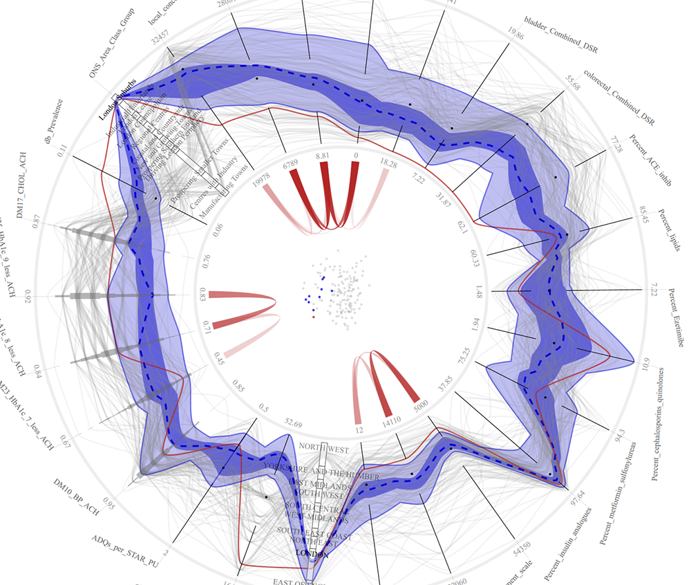
This image visualizes data about primary care trusts (PCTs) in the United Kingdom. Each axis on the circle represents a medical conditions being measured (for example, lung, bladder and colorectal cancer), and each wavy grey line represents the scores for each variable for each PCT. Dark blue shows the median measure of occurrences of each condition, and the thin red line is a measure for one PCT in a London suburb, which shows a low rate of all cancers except esophogal cancer. The visualization is meant to be interactive, so that a user can click on any one data point and see how a particular condition relates to other variables (such as income level) or which PCTs have similar profiles. Data from medical records at Duke and Harvard are being used by RENCI to create a similar visualization system. (Data courtesy of the UK National Health Service)
The partnership was useful several times throughout the course of the project, particularly when the data set expected from the project’s primary funder, the U.S. Department of Defense (DoD), did not materialize.
The DOD provided funding for the project with the idea of using data gleaned from real-life soldiers with Post-Traumatic Stress Disorder (PTSD). The DoD data set was to contain information on both pre- and post-deployment units, with variables such as individuals’ genetics, environmental backgrounds, symptoms, and wartime experiences. Borland planned to create a graphic display of that data in which every data element would be a spike, and a range of “standard” data, or the average expected data, would look like a circle.
However, using medical data about human subjects requires approval by an Institutional Review Board (IRB) in order to protect the subjects’ privacy and ensure all data is used ethically.
“We had a lot of problems getting DoD IRB approval due to logistical issues,” Hammond said. “So for eight months we had no actual clinical data and had to use a proxy set with similar characteristics.”
The team was able to use two different “practice” data sets: one of automobile data with variables such as miles per hour and miles per gallon; the other consisting of the query requests of researchers and clinicians at Duke medical centers. The second set was particularly valuable, according to Hammond, because it allowed the team to see how a data visualization could identify common and uncommon characteristics among physician queries. In turn, this helped the researchers create an algorithm that uses query commonalities to identify diseases in an unbiased way.
After using and learning from these data sets, Borland and Hammond decided to test their ideas on health-related data from the United Kingdom’s National Health Institute. This data was related primarily to environmental risk factors related to health, with variables that included rates of different types of cancer, diabetes prevalence, and region classification (industrial versus countryside, for example).
“Using the tool we developed, we were able to find interesting relationships within this data,” Borland said. “For example, we can see clusters of regions in England and visually link the characteristics of these regions that make them similar in a statistical sense, and likely to have similar health outcomes. That will certainly be valuable when we start looking at PTSD rates.”
According to Hammond, the project has just started and has great potential to benefit a wide variety of health care sectors.
“This has opened the door,” Hammond said. “We now meet with RENCI every other week and are looking at many other possibilities to apply what we have done thus far. One of the most important things that I think will come out of this research is that we will be able to more finely tune disease. Diabetes, for example, is a broad category; with greater insight into the data surrounding it, that category might actually become six.”